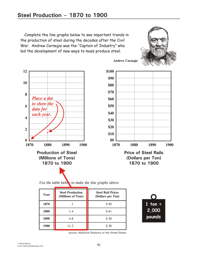
Steel Production Graphs - a step-by-step guide
 
Frameworks for America's Past
Return to Originating Page


Place dots for the data

   As a first step, place dots on the chart (page 50 of your study guide) to show the data for steel production in each of the four years shown on the graph.  The data can be found in the table at the bottom of the page.
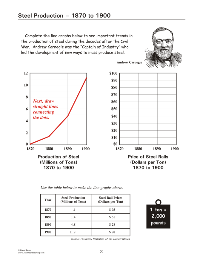


Connecting the dots

   Next, draw straight line segments to connect the four dots.  The result should look like the graph on the page below.


Repeat the process!

   Follow the same steps to complete the other graph on the same page, using the data shown in the right hand column of the table.


The graphs are by David Burns.


Copyright Notice

   Copyright 2017 by David Burns.  All rights reserved.  As a guide to the Virginia Standards of Learning, some pages necessarily include phrases or sentences from that document, which is available online from the Virginia Department of Education.  The author's copyright extends to the original text and graphics, unique design and layout, and related material.