 |
Fasttrack
to America's Past Teacher Key |
|
|
Fasttrack
to America's Past Teacher Key |
|
 Page 222 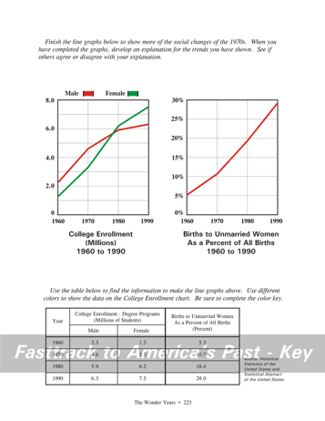 Page 223 |
Pages 222
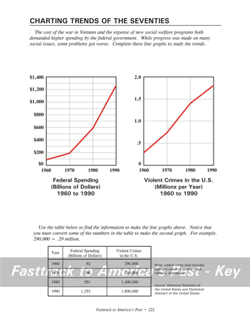
& 223 - Charting Trends of the Seventies Making the charts, page 222 You will need a color pencil for the line graphs on this page. Red is a good choice. Study the tables, then neatly place dots for the data and connect the dots with straight lines. What the charts show, page 222 These two graphs show a pattern that still generates considerable political debate. Federal spending was rising sharply, with much of the increase due to new social welfare programs intended to help citizens improve their lives. No doubt many citizens were helped by such programs. But a large number of people turned to crime, especially violent crime, during the same years. One argument suggested that as the government took more responsibility for citizens' lives, the traditional sources of stability in society - families, neighborhoods, and churches - had less influence. An opposite point of view held that even the expanded federal programs did not do enough to meet the needs of a society undergoing great changes in these years. Making the charts, page 223 You will need two color pencils to complete the line graphs on this page. Red and green are good choices. The first graph on this page is really two line graphs in one. It is easiest to do each part separately. Use the red pencil to place dots for the data shown in the table for college enrollment of males. Then connect the dots with straight lines in the same color. Next, use the green pencil to place dots for the data showing female college enrollment. Connect the dots with straight lines using the same color. Be sure to complete the key with your color pencils. For the graph of Births to Unmarried Women, use the red color pencil to place the dots for the data shown in the table, and then connect the dots with straight lines. What the charts show, page 223 The College Enrollment graph shows that young men and women were enrolling in college degree programs in increasing numbers during these years. The biggest change, however, came for young women. Many factors were behind these trends, but certainly a key factor was the broader movement by women to expand their opportunities in the work place. By 1980 the number of women in college exceeded the number of men. The last graph shows a pattern that has generated great concern since the late 1960s. Many observers have argued that the data reveals a serious weakening of the role of marriage and the traditional family in American life. |
|
Copyright Notice
Copyright 2018 by David Burns. All rights reserved. Illustrations and reading selections appearing in this work are taken from sources in the public domain and from private collections used by permission. Sources include: the Dover Pictorial Archive, the Library of Congress, The National Archives, The Hart Publishing Co., Corel Corporation and its licensors, Nova Development Corporation and its licensors, and others. Maps were created or adapted by the author using reference maps from the United States Geological Survey and Cartesia Software. Please see the home page for this title for more information. |