| Fasttrack
to America's Past Teacher Key |
|
| Fasttrack
to America's Past Teacher Key |
|
 Page 168  Page 169 |
Pages 168
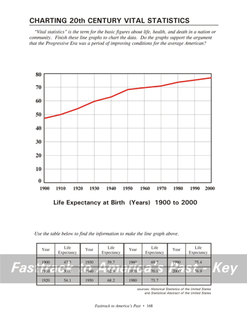
& 169 - Charting 20th Century Vital Statistics Making the chart, page 168 Students will need a color pencil for the line graph on this page. Red is a good choice. Students should study the table, then neatly place dots for the data and connect the dots with straight lines. What the chart shows, page 168 The graph shows a steady increase in the
life span of Americans
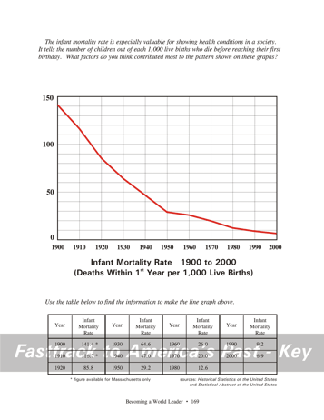
born during the 20th century. Making the chart, page 169 Students will need a color pencil for the line graph on this page. Red is a good choice.Students should study the table, then neatly place dots for the data and connect the dots with straight lines. What the chart shows, page 169 The graph shows a rapid drop in the infant mortality rate during the 20th century. That means that fewer young children were dying during the first year of life. Infant mortality data is considered a key indicator of health and living conditions in a society. It also indicates the quality of medical care commonly available to infants. The rapid fall in the U.S. infant mortality figures after 1900 is certainly due to improvements in all these areas. Life was still a hard struggle for many, but there was also a clear pattern of economic growth that brought better living conditions for most families. Medical care was also advancing because of growing knowledge about the causes of disease and better education for doctors. Background
for the chart
question, page 168 The graphs on these
pages do support
the idea that the Progressive Era was a period of improving conditions
for the average American.
Background for the chart question, page 168 There are certainly
many factors
that contributed to the fall in infant mortality rates in
American
during the 20th century.
While the century did
see some dramatic
downturns in the economy, the overall trend for wages and business
growth
was steadily upward. To understand the importance of this,
consider
that one economist has estimated that a steady two percent annual
growth
in the national economy will produce, over time, more benefit than
all the government social welfare programs combined. |
|
Copyright Notice
Copyright 2018 by David Burns. All rights reserved. Illustrations and reading selections appearing in this work are taken from sources in the public domain and from private collections used by permission. Sources include: the Dover Pictorial Archive, the Library of Congress, The National Archives, The Hart Publishing Co., Corel Corporation and its licensors, Nova Development Corporation and its licensors, and others. Maps were created or adapted by the author using reference maps from the United States Geological Survey and Cartesia Software. Please see the home page for this title for more information. |