 |
Fasttrack
to America's Past Teacher Key |
|
|
Fasttrack
to America's Past Teacher Key |
|
 Page 154 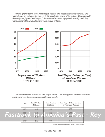 Page 155 |
Pages 154
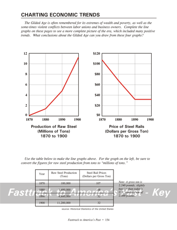
& 155 - Charting Economic Trends Making the charts, page 154 Students will need a color pencil for the two line graphs on this page. Red is a good choice. Students should study the table, then neatly place dots for the data and connect the dots with straight lines. For the first graph, point out that raw steel production in 1870 was only 0.1 million tons (that is, 100,000 tons), so the dot for 1870 will be only slightly above the 0 line. What the charts show, page 154 These two graphs show a pattern typical of
many big industries
in the Gilded Age. The production of steel was growing with
incredible
speed, while the price of the product fell dramatically over the period. Making the charts, page 155 Students will need two color pencils to complete the line graphs on this page. Red and green are good choices.The first line graph on this page is really two graphs in one. Explain to students that it is easiest to do the parts one at a time. For example, use the red pencil to place only the dots for the data about total employment of workers. Then connect the dots with the red pencil. Next, use the green pencil to place only the dots for the data about farm employment. Then connect those dots with the green pencil. Make the other graph on this page using the red color pencil and the data in the table for wages. "Real Wages" means the pay statistics have been adjusted for any changes in the purchasing power of the dollar during this period. What the charts show, page 155 These two graphs also show important trends in the economy of the U.S. during the Gilded Age. Employment was growing rapidly, mainly driven by growth in industry, although farm employment was also growing. Also, the average pay for workers in industry was rising. "Real Wages" means the pay statistics have been adjusted for any changes in the purchasing power of the dollar. Therefore, the increase in the numbers on the graph represents a real increase in what a worker could buy with his or her pay. Background
for the chart
question, page 154 The four graphs on these pages highlight
some important facts about industry and life for workers in the Gilded
Age. This is an important point, because accounts of the Gilded Age often leave students with the impression that life for workers in this era was going from bad to worse. Certainly many workers experienced bad conditions on the job that would never be tolerated in an America factory today. But for most workers, life in America was getting better, not worse. That is the main fact that attracted so many immigrants in this era. |
|
Copyright Notice
Copyright 2018 by David Burns. All rights reserved. Illustrations and reading selections appearing in this work are taken from sources in the public domain and from private collections used by permission. Sources include: the Dover Pictorial Archive, the Library of Congress, The National Archives, The Hart Publishing Co., Corel Corporation and its licensors, Nova Development Corporation and its licensors, and others. Maps were created or adapted by the author using reference maps from the United States Geological Survey and Cartesia Software. Please see the home page for this title for more information. |