 |
Fasttrack
to America's Past Teacher Key |
|
|
Fasttrack
to America's Past Teacher Key |
|
 Page 132 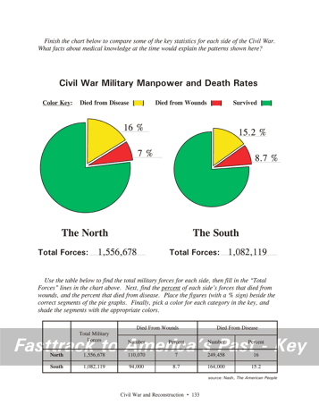 Page 133 |
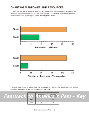
Pages 132
& 133 - Charting Manpower and Resources Making the chart, page 132 Students will need two color pencils for these bar graphs. Green and orange are good choices. Students should study the table, then neatly draw bars of the correct length to graphically show the data. Since both graphs show data for the North and the South, use the same color scheme for both. What the chart shows, page 132 These bar graphs show that the South was at
a big disadvantage
in both manpower and industrial capacity as the Civil War began. Making the chart, page 133 Students will need a #2 pencil and three color pencils to complete this chart. Red, yellow, and green are good.Students should study the table carefully. There is more data given than is needed for the graphs, so students must follow the directions carefully. The best approach is to follow the directions one step at a time. First, fill in the figure for the total military forces for each side. Then find the percent of each side's forces that died from wounds, and the percent that died from disease. Do this for one side at a time so you don't become confused! Place the figures, with a "%" sign, beside the correct pie segments. Finally, use red for the segments that show deaths from wounds, yellow for deaths from disease, and green for the remaining forces. Don't forget to color the key to match. What the chart shows, page 133 This chart shows that for both the North and the South, disease was by far the biggest killer, not wounds from the battles. The chart also shows that the North had more men serving in the military during the war. A slightly higher proportion of Northern soldiers died from disease, compared to Southern soldiers, but a lower percent died from wounds. Background for the chart question, page 133 Medicine had made some advances by 1861, including anesthesia, which both sides had and used effectively. But doctors did not understand the causes of disease, and therefore could do little to cure or prevent them. It was only in the decades after the Civil War that doctors and scientists developed the germ theory of disease. |
|
Copyright Notice
Copyright 2018 by David Burns. All rights reserved. Illustrations and reading selections appearing in this work are taken from sources in the public domain and from private collections used by permission. Sources include: the Dover Pictorial Archive, the Library of Congress, The National Archives, The Hart Publishing Co., Corel Corporation and its licensors, Nova Development Corporation and its licensors, and others. Maps were created or adapted by the author using reference maps from the United States Geological Survey and Cartesia Software. Please see the home page for this title for more information. |