 |
Fasttrack
to America's Past Teacher Key |
|
|
Fasttrack
to America's Past Teacher Key |
|
 Page 112 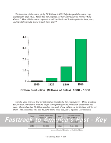 Page 113 |
Pages 112
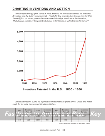
& 113 - Charting Inventions and Cotton Making the chart, page 112 Students will need just one color pencil for this line graph. Red is a good choice. Point out to students that each of the small marks represents 100, so the first dot they place will be close to the zero. After students place small dots for the data, have them connect the dots with straight lines. What the chart shows, page 112 This chart shows that in the early 1800s, a
very significant
change was underway in the United States. As the Industrial
Revolution
began, inventors saw the opportunity to profit by developing ideas and
applying for patents. There are ups and downs in the early
decades
due to various factors, but clearly the trend is upward. Around
1850
the number of patents issued is soaring. Making the chart, page 113 Students will need just one color pencil for this bar graph. Green is a good choice. Notice that the numbers in the table must be converted to millions. The first figure, 73,000, is equal to less than one tenth of one million. So the first bar will be very short. (Each small mark represents one tenth million, or 100,000.)The second bar will also be fairly short, since the figure for 1820 is 0.335 million. What the chart shows, page 113 This chart shows rapid growth of the cotton crop in the United States in the decades leading up to the Civil War. Cotton was not widely grown before 1800, because the seeds are difficult to get out of the raw cotton by hand. The invention of the cotton gin in 1793 by Eli Whitney changed the economics of cotton growing. The new machine made it easy and cheap to remove the seeds. Suddenly, the crop became very profitable, and was widely planted in the Southern states. Students should also know that the spread of cotton growing tended to increase the demand for slavery. Background for the chart question, page 112 One of the dramatic jumps on the graph is the period from 1820 to 1830. The jump is probably related to the rise of the textile industry in the New England states. This decade is often cited as evidence that the Industrial Revolution had taken hold in America. Another impressive jump comes in the decades of the 1840s and 1850s. By that time the railroad industry was growing very rapidly, and factories of all kinds were being established. Steam power was replacing water wheels. All of these changes involve new ideas and new technology, and this is reflected in the patent figures. Background
for the chart
question, page 113 The cotton crop tended
to pull the
North and South together because textile factories that began growing
in
the New England states needed the cotton grown in the South.
Cotton
was cheaper than wool, and was easily adapted to the machine production
of thread and cloth. Many Northern factory owners realized that
their
financial interests were closely connected to the cotton crop grown in
the South. |
|
Copyright Notice
Copyright 2018 by David Burns. All rights reserved. Illustrations and reading selections appearing in this work are taken from sources in the public domain and from private collections used by permission. Sources include: the Dover Pictorial Archive, the Library of Congress, The National Archives, The Hart Publishing Co., Corel Corporation and its licensors, Nova Development Corporation and its licensors, and others. Maps were created or adapted by the author using reference maps from the United States Geological Survey and Cartesia Software. Please see the home page for this title for more information. |