 |
Fasttrack
to America's Past Teacher Key |
|
|
Fasttrack
to America's Past Teacher Key |
|
 Page 52 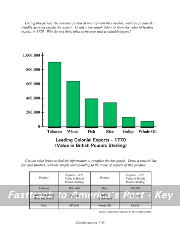 Page 53 |
Pages 52
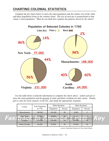
& 53 - Charting Colonial Statistics Students will need two contrasting color pencils for the pie charts on page 52. Remind students that the lettering for the pie graphs should be done very neatly with a #2 pencil or an erasable ink pen. Color pencils are not very good for small lettering, and a mistake made with a regular ink pen cannot be corrected. You can give students a quick peek at what the finished chart should look like, but insist that they do their work from the data in the table. Students will also need a color pencil for making the bar graph on page 53. Tell students to mark the top of each bar first, by using the data in the table. What the chart shows, page 52 This chart shows the wide variation in the ethnic make-up of the colonies. Massachusetts had only a small black population, while South Carolina was majority black in 1750. Notice that Virginia had the largest population, with Massachusetts not far behind. The graphs would be very different if an earlier date, such as 1650, were chosen. The black population was very small in the early Colonial era, but grew more rapidly after 1700.Background for the chart question, p. 52 The pattern shown by the pie charts reflects
the pattern
of slavery in the colonies. Although there were free blacks in
the
Colonial era, the majority were held as slaves. In the Southern
colonies,
large plantations were heavy users of slave labor. In Northern
colonies,
climate and soil conditions made the plantation style of agriculture
unprofitable.
As a result, there were fewer slaves.
What the chart shows, page 53 This chart shows that tobacco was the single most important crop in the colonial export trade. It also shows that a number of other products were also important, however.Students may ask, "How much was a British Pound Sterling worth in today's American money?" Direct comparison of the value of money across very long time periods is always difficult and can be misleading. A very rough estimate would put the purchasing power of one British Pound in 1770 equal to about 200 U.S. dollars today. Background for the chart question, page 53 The graph shows that tobacco was the most valuable export in 1770, well ahead of the other products shown. In spite of its health risks - which were commented on even back in those days - tobacco became very widely used in Europe and America. The nicotine in tobacco is addictive for many users. It's important to notice that the trade in other products was also very large. The combined value of the next two most important exports (wheat and fish) was greater, for example, than the value of the tobacco crop. |
|
Copyright Notice
Copyright 2018 by David Burns. All rights reserved. Illustrations and reading selections appearing in this work are taken from sources in the public domain and from private collections used by permission. Sources include: the Dover Pictorial Archive, the Library of Congress, The National Archives, The Hart Publishing Co., Corel Corporation and its licensors, Nova Development Corporation and its licensors, and others. Maps were created or adapted by the author using reference maps from the United States Geological Survey and Cartesia Software. Please see the home page for this title for more information. |